
Outcome
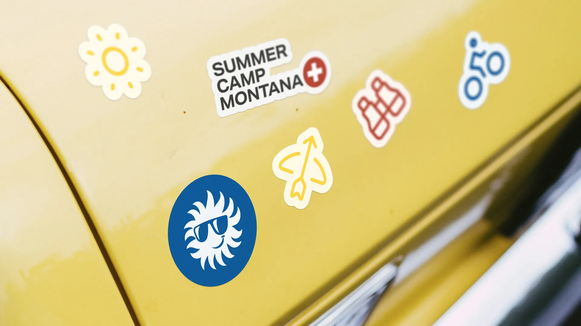
The brand came first. A subtle rebranding brought what Camp Montana needed. The identity was cleaned up and made more consistent, while keeping the logo generations of campers recognise. The camp now speaks with one clear voice about what it is, a safe haven built on human connection, and what it is not, a performance-driven programme. A new family of icons and badges adds warmth and instant recognition, giving every touchpoint the same friendly coherence.
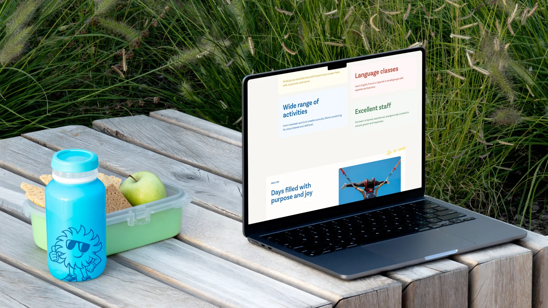
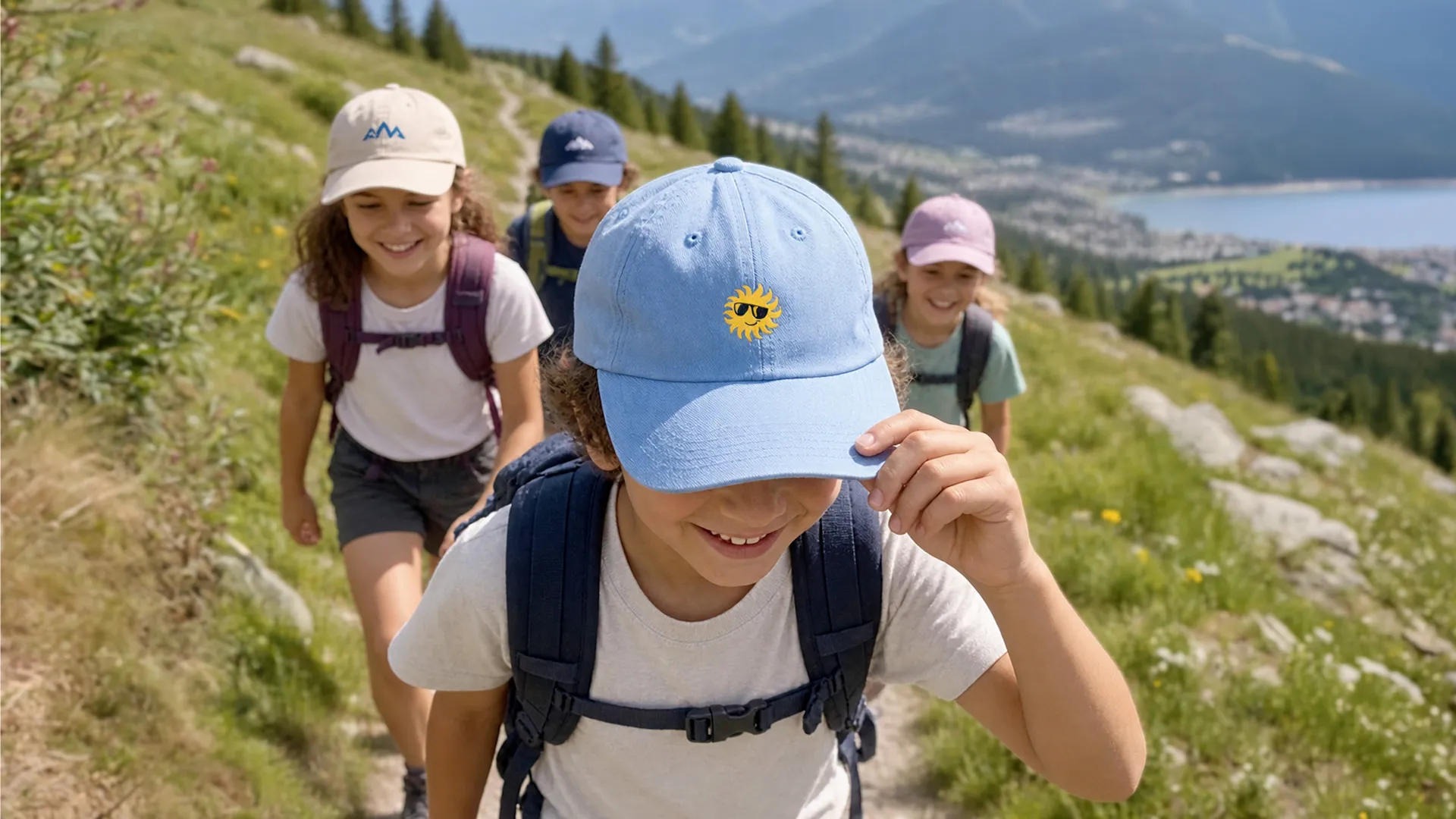
Online, the result is a warm, reassuring website where photography gives the stage back to the campers and the moments they share. The tone speaks to two audiences at once. Parents need clarity and peace of mind before letting go. Young campers are looking for adventure and a place to belong. Safety is no longer hidden in the fine print. It is communicated openly, as part of the brand promise. On the structural side, the path to enrolment was simplified, so sessions, prices and practical information are always a click away, in three languages.
What we delivered:
- A brand strategy workshop with the Camp Montana team to define the brand territory, points of differentiation and positioning
- A subtle rebranding: a cleaner, more consistent identity built around the existing logo
- A sharper positioning that clearly expresses what Camp Montana is, and what it is not
- A brand guide documenting positioning, values and visual rules
- A new family of custom icons and badges
- A warm, human and reassuring brand voice, rooted in the "safe haven" positioning
- A site architecture built around the questions and needs of parents
- A multilingual website in English, French and Italian
- An intuitive Webflow CMS so the team can manage content on its own
- A modern, fully responsive design
Project team

Chris Bachmann

Manuel Cina

Sergei Shevchenko

Pauline Michot

Sylvie Rapillard