
Outcome
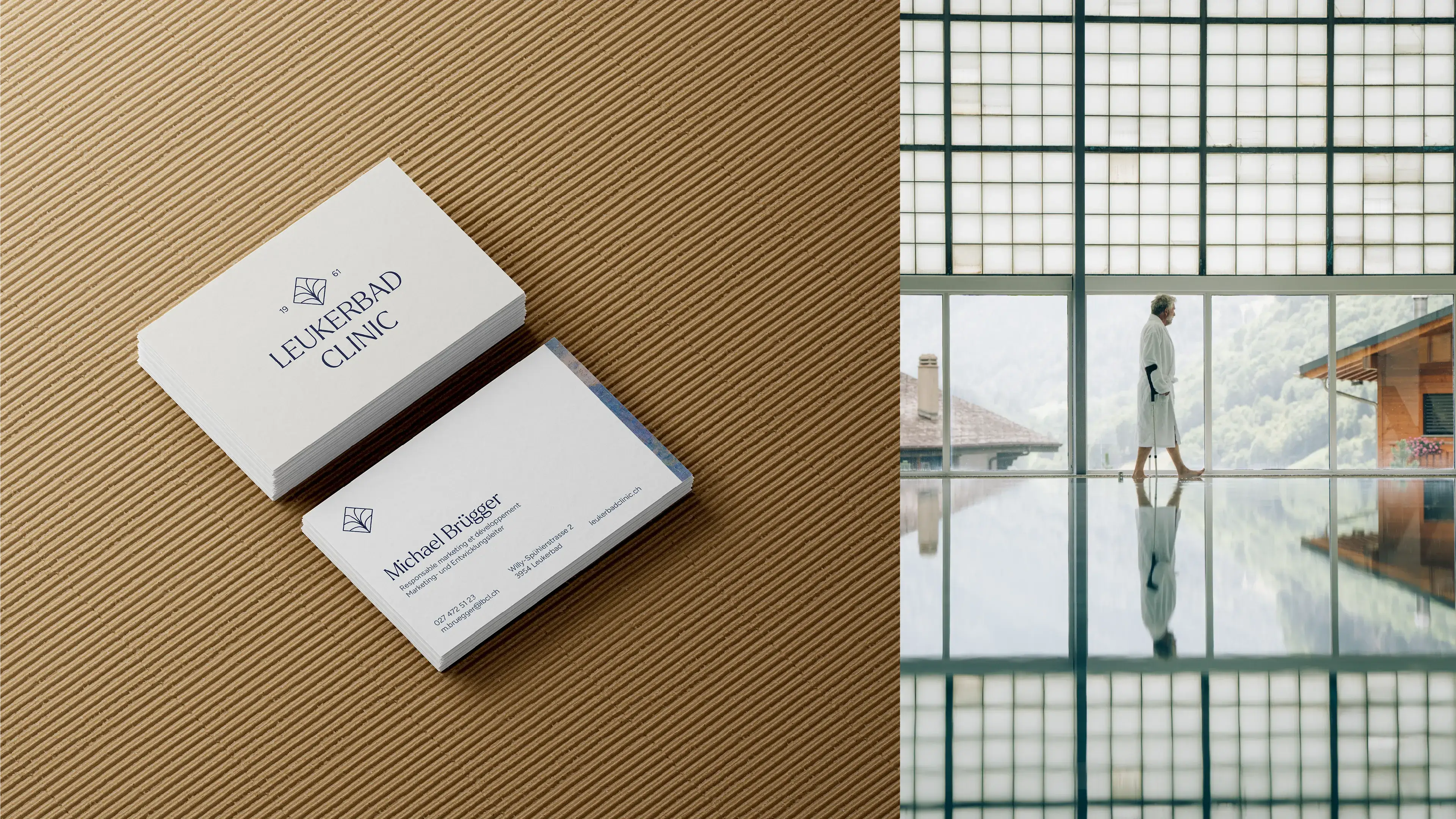
The result is a refined and flexible identity built around a simple idea: rehabilitation means moving forward. The new brand balances medical credibility with warmth and humanity, moving away from both conventional healthcare aesthetics and the codes of wellness.
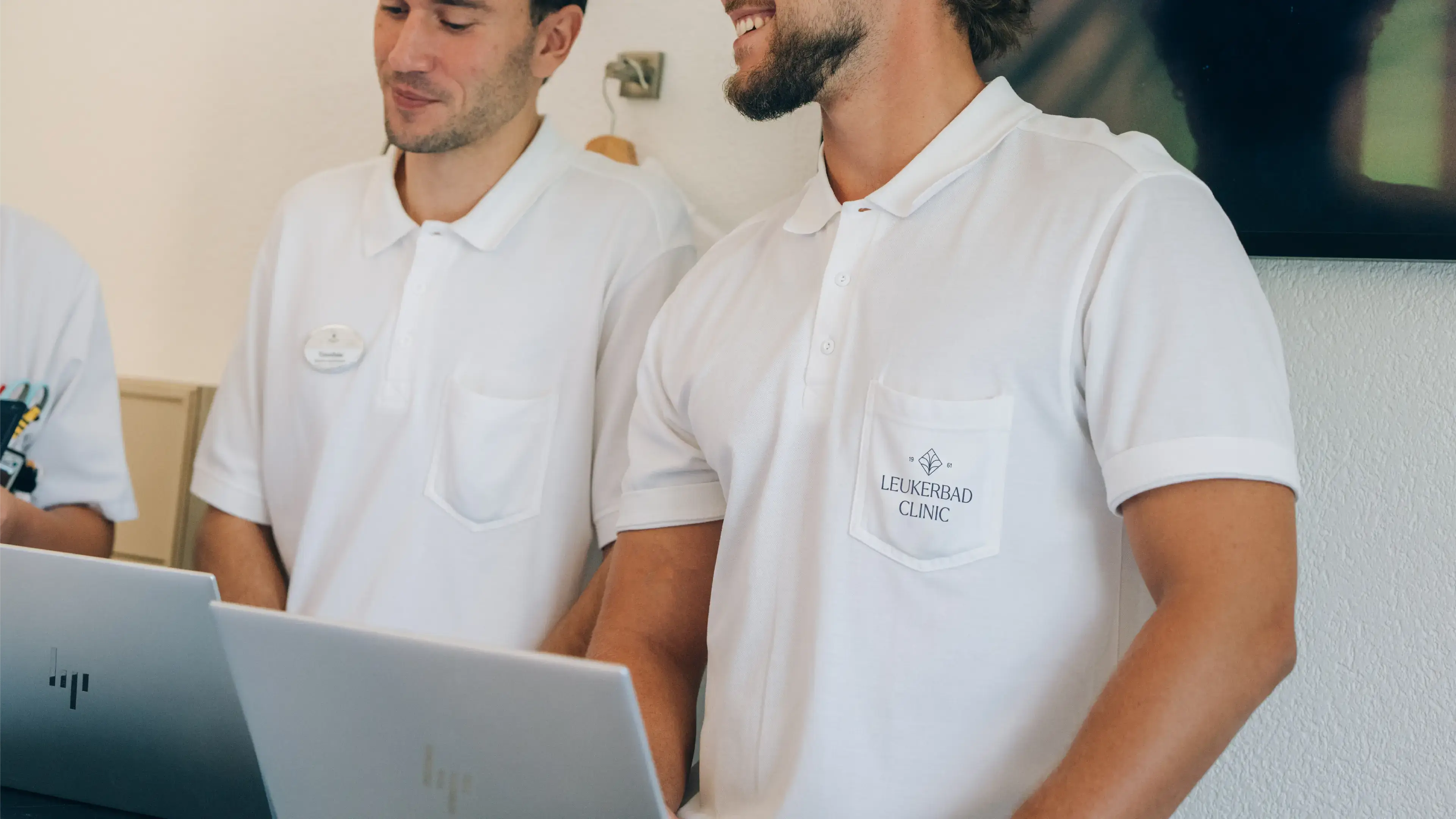
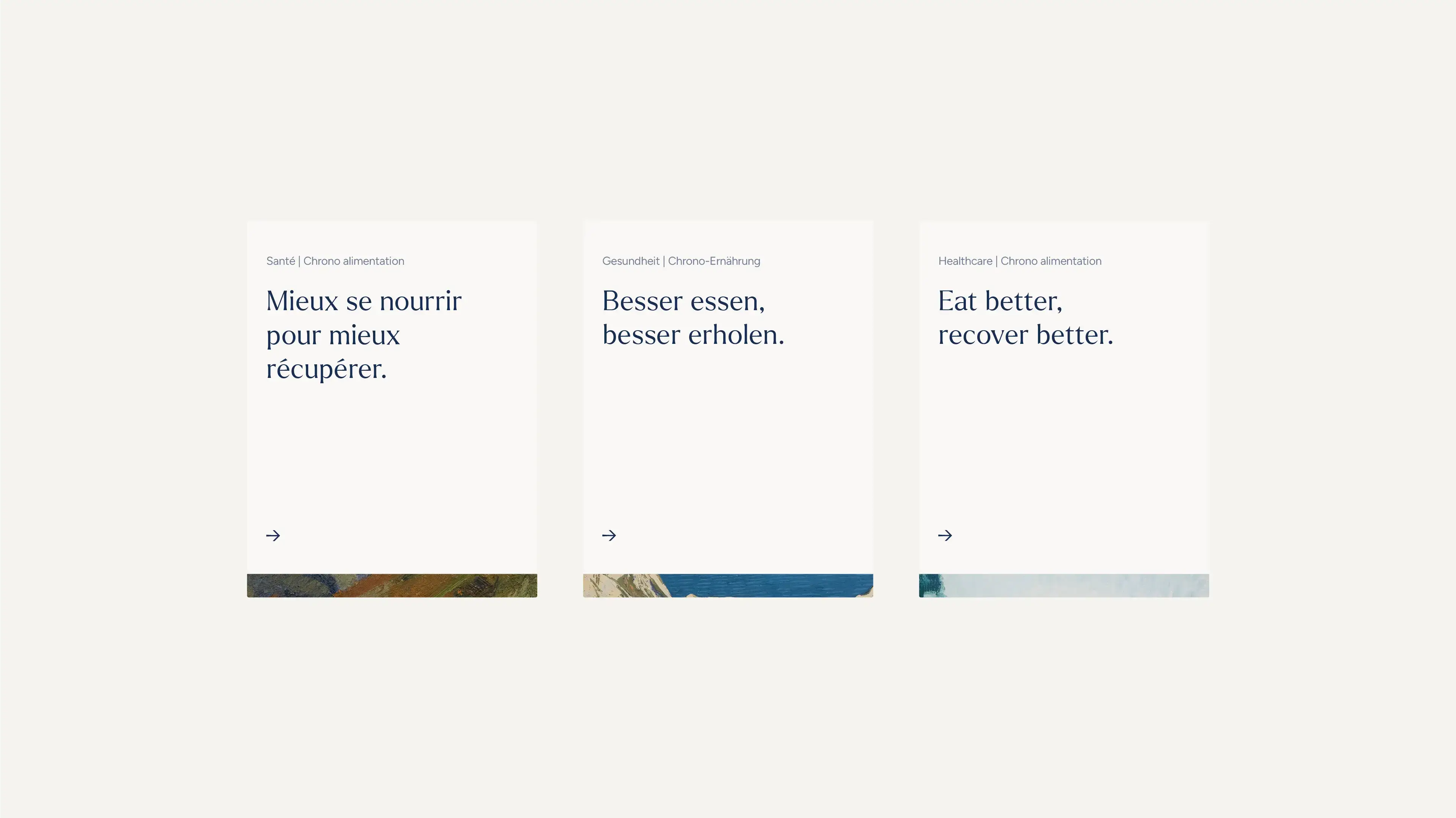
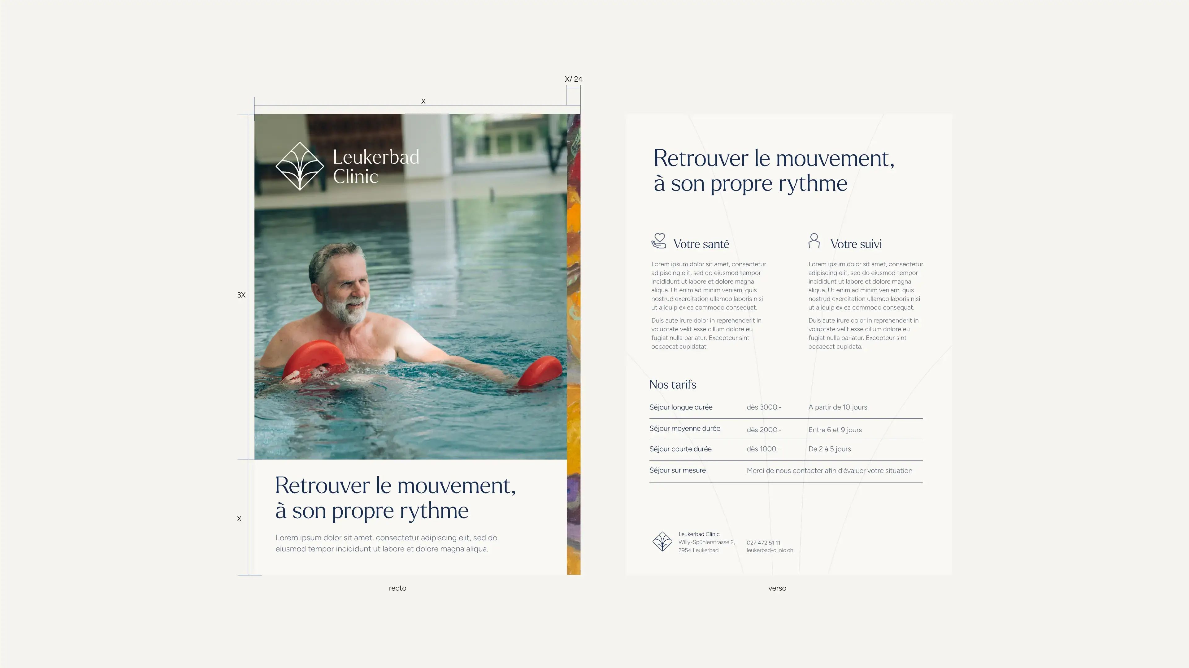
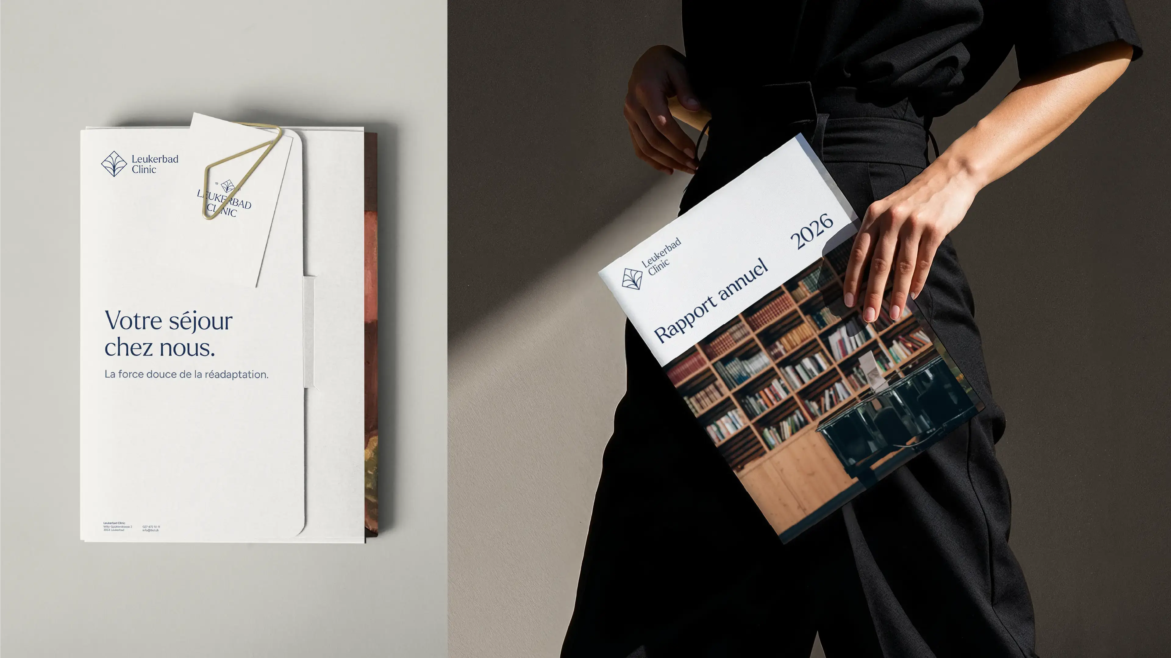
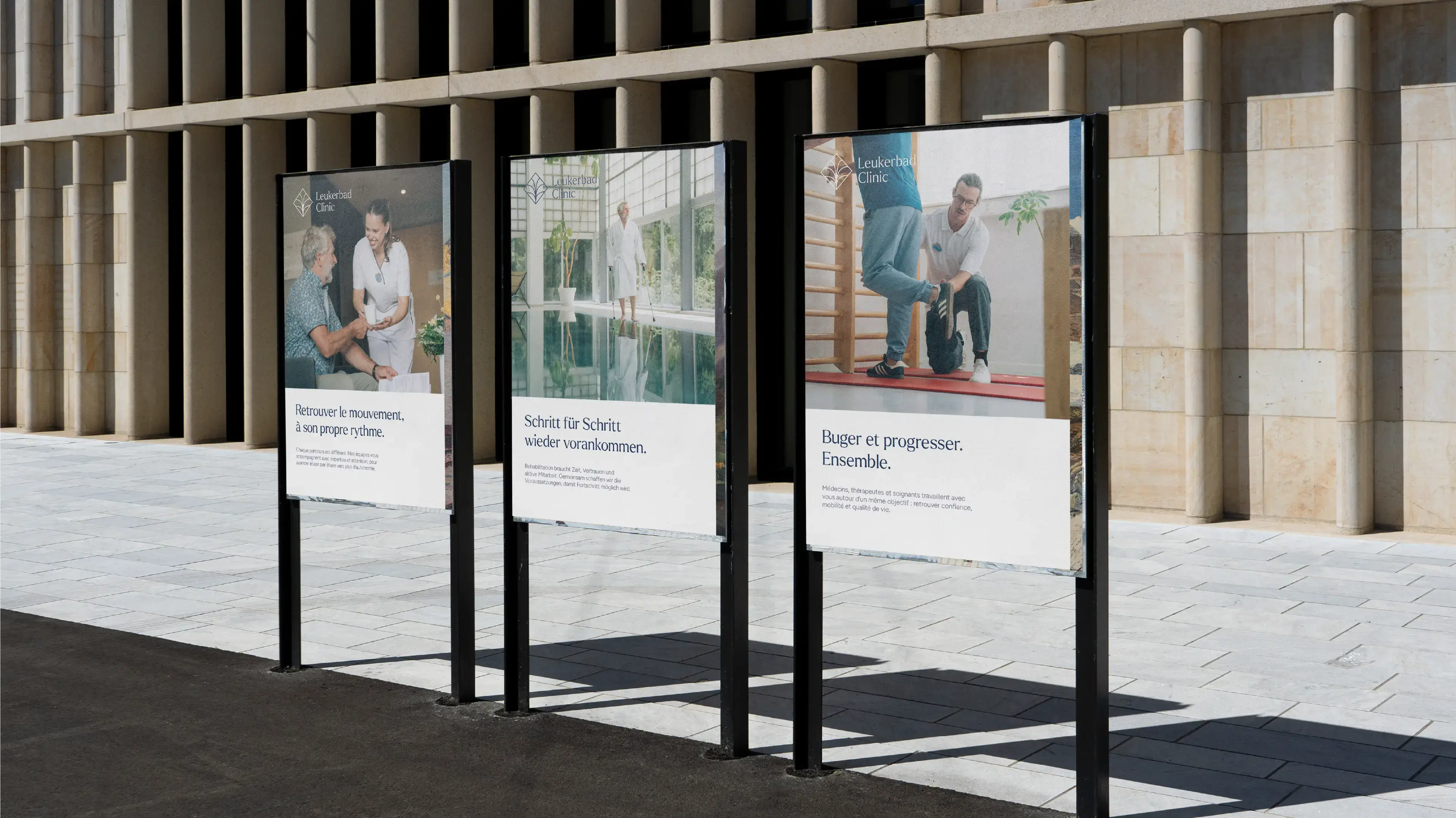
A redesigned logo, expressive typography and a calm yet distinctive colour palette create a more confident visual presence, while a modular system of symbols, graphic elements and sub-brands gives the clinic room to communicate across very different services and touchpoints. From patient information and signage to digital communication and campaigns, every element is designed to feel clear, reassuring and purposeful.
At the centre of it all is one shared message: Bouger et progresser. Ensemble.
- Brand strategy and positioning
- Full visual identity redesign
- New logo and flexible logo system
- Brand architecture for services and sub-brands
- Colour palette and typography system
- Brand messaging and tone of voice
- Campaign concept and art direction
- Print and patient communication materials
- Comprehensive brand guidelines
Project team

Manuel Cina

Pauline Michot

Chris Bachmann

Michael Brügger

Board of directors