destinazio logo, inverted white, on dark background
destinazio. — internal reference

Brand & Style Guide

The single source of truth for how destinazio looks, sounds and behaves — for people and for AI.

For AI: read this whole page before generating any new page, slide deck, PDF or document for destinazio. It defines the only colors, type and components allowed — do not invent new ones.
Verified 22 Sept 2026

Rules for AI-generated content

  1. Colors. Use only the tokens in "Design tokens" below. Never invent a color.
  2. Typeface. Brown only — weights Thin (100), Light (300), Regular (400), Medium (500), Bold (700). No system fonts, no Comic Sans, ever.
  3. Type scale. Follow the sizes and weights in "Typography" exactly — don't improvise new sizes.
  4. Buttons. Strictly use the description and examples from the Buttons section.
  5. Logo. Always "destinazio." with its dot — never redraw, recolor freely, stretch or drop the dot.
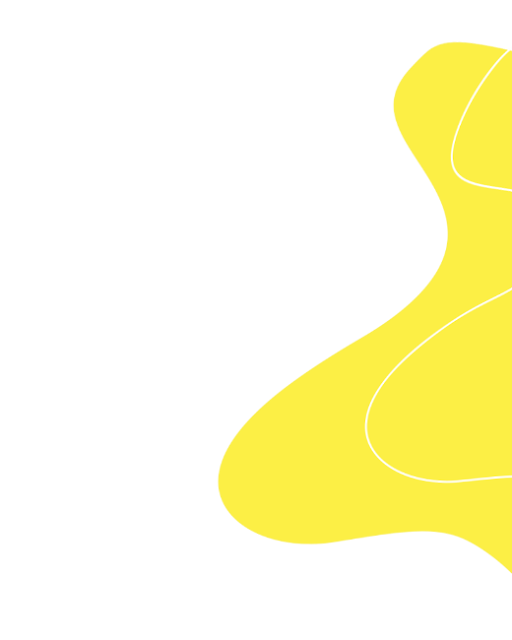
  6. Destinazio clouds. The yellow blob shape is a decorative accent — use it sparingly, never as a background pattern.
  7. Voice. Confident, precise, understated. Short declarative sentences. No hype, no generic agency clichés.
  8. When unsure. Prefer restraint — black, white, one yellow accent, generous white space — over decoration.


Voice & values

Positioning

We are a boutique for digital quality — not a full-service agency or an implementation company on demand. We see ourselves as a sparring partner that helps brands translate substance into a clear digital form.

Why we exist

Good work should be visible. Not loud, not overloaded — clear, well thought-out and consistent. We design digital presences that do justice to what lies behind them. No solutions that are "just online." No design without substance.

"We want to be among the benchmarks by which digital quality is measured."

— Our vision

01

Substance over style

We don't design anything we don't understand. Design without content is not design.

02

Care over speed

Details are not a luxury. They are part of quality.

03

Clarity over complexity

We simplify where others seek to impress. Comprehensibility is a sign of maturity.

04

Progress over perfection

We want to improve — not be perfect. Quality comes from consistency, not stagnation.

05

Attitude over hype

We are only interested in trends if they serve a purpose.

Culture & brand voice

Use this to calibrate tone, and as extra values/traits beyond the five in the Voice section above.

How we work

Strategy before screens

We don't jump into execution without clarity. Every visual decision is firmly grounded in strategy and serves a specific purpose.

Empathy before ego

We listen before we create. Understanding what truly moves people makes communication honest, relevant, and real.

Function meets beauty

Beauty is never decoration. Our designs are aesthetic because they work, and they work because they have purpose.

Honesty over hype

We believe in authenticity over exaggeration. No buzzwords, no empty promises — just honest work that makes a real impact.

What sets us apart

Authentic

We stay true to ourselves and invite our customers to do the same.

People-centric

We care about people — our team, our customers, their audiences.

Open

Driven by trust and curiosity for cultures.

Curious

We question, experiment and grow.

Remote-first

We embrace flexibility, freedom, and asynchronous collaboration.

Quality-driven

Every pixel, every line of code, every interaction matters.

Brand manifesto (voice sample)

Cheers to the fire that drives creators, dreamers, and entrepreneurs — to build something greater than themselves. To the spark that turns ideas into brands, visions into movements, and stories into legacies. We exist to bring that spark to life: crafting digital experiences that are bold, beautiful, and deeply human. For the makers, the storytellers, the ones who create not just to sell, but to share their soul with the world. Because the world needs more brands with heart, more courage, more stories that dare to stand out. Let's build something extraordinary.

— Brand manifesto

Treat the manifesto above as the reference sample for brand voice — first-person plural (“we”), short declarative sentences building rhythmically to a call to action, warm but never sentimental or hype-y. The principles and traits here describe working style and company culture; they complement, not replace, the five values in the Voice section above — draw on both when writing brand-voice copy.

Design tokens — Colors

Yellow
#FBEB43
var(--yellow)
Primary accent — CTAs, highlights, small emphasis. Never as a large body background.
Black
#061012
var(--black)
Headings, body text, button borders.
White
#FFFFFF
var(--white)
Base background, text on dark.
BG
#FBFBFB
var(--bg)
Off-white section background.
Dim Grey
#717171
var(--dim-grey)
Secondary text, labels.
Dim Grey-2
#4B4B4B
var(--dim-grey-2)
Body copy on light backgrounds.
Dark Slate Blue
#323949
var(--dark-slate-blue)
Occasional dark accent.
Gainsboro
#D8D8D8
var(--gainsboro)
Borders, dividers.
Grey
rgba(129,129,139,.3)
var(--grey)
Overlays, scrims.
Grey — subtitle
#969696
var(--grey-subtitle)
Captions, subtitles.
White Smoke
#F1F3F4
var(--white-smoke-light-grey)
Light section background.

Typography

Typeface: Brown.

ThinLightRegularMediumBold
Aa Destinazio
.h1--pages — 96px / Regular 400 / letter-spacing -2px — hero pages only

Aa Destinazio

h1 — 48px / Medium 500 / line-height 1.2

Aa Destinazio

h2 — 48px / Medium 500 / line-height 1

Aa Destinazio

h3 — 24px / Medium 500

Aa Destinazio

h4 — 16px / Medium 500
Aa Destinazio
h5 — 14px / Medium 500
Aa Destinazio
h6 — 12px / Medium 500

The quick brown fox jumps over the lazy dog. Clean, modern and without frills — just like us.

p — 17px / Light 300 / line-height 1.3

The quick brown fox jumps over the lazy dog. Clean, modern and without frills — just like us.

p — 20px / Light 300 / line-height 1.3

Buttons

.button-circle._2.bg--white.is-ai-sg — Primary button: pill shape (100px radius), 20px/30px padding, 1px solid black border, transparent fill, 17px / 500 (medium) black label, 300ms ease transition. Hover: fill inverts to solid black, label turns white. .link__wrap + .link-block-underline + .hover-line + .arrow-right-circle — Secondary link: text label with a hidden underline bar (revealed on hover) paired with a 50×50px circular arrow icon, 1px solid black border, fully rounded. Used for in-page navigation, not as a primary call to action.

Destinazio clouds

Alongside the logo, colour palette and typography, the “clouds” — soft yellow blob shapes — are one of the brand's recognisable elements. The static shape is a simplified illustration for print and static layouts; the animated shape is the actual production motion asset (“Blob V3”), the same one used behind the homepage hero. Moderate use only: an accent, never a background pattern or a substitute for content.